The Convergence is an impact focused global creative network functioning as a collaborative innovation lab and production house.
Our mission is to unite creative talent from across the globe to amplify positive impact for the future of our planet.
ROLE:
Brand Strategy & Design
Content Creation
UI Design

The process:
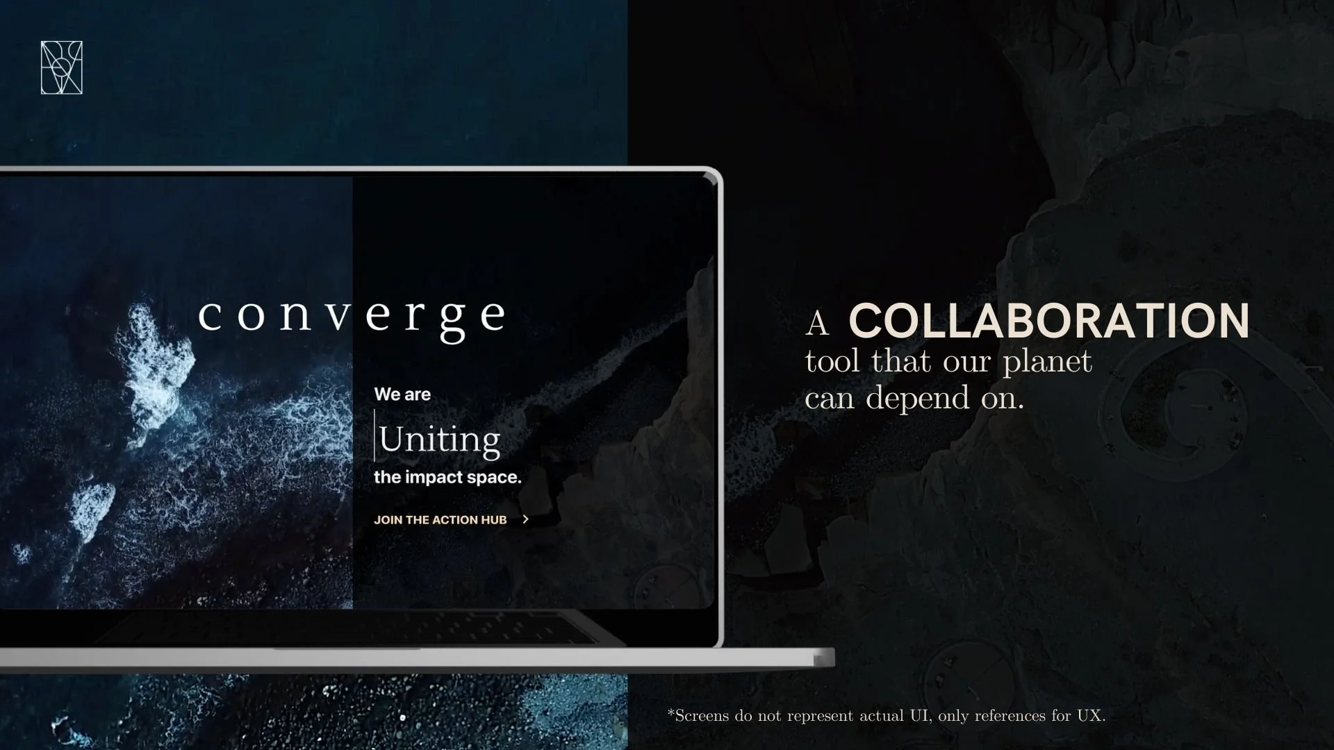
The Convergence dwells at the intersection of art, action, and activism. I worked with the Convergence team to design something that would appeal to film makers, designers, NGOs, UN Organizations, and global impact funds.
We leverage our network to ideate, design, produce, and deliver projects and solutions on a global scale.
Our mission is to unite experts, organizations and creatives from around the world to amplify the positive impact on the future of our planet through collaboration, multi-disciplinary projects, and philanthropic initiatives.
Brand Design
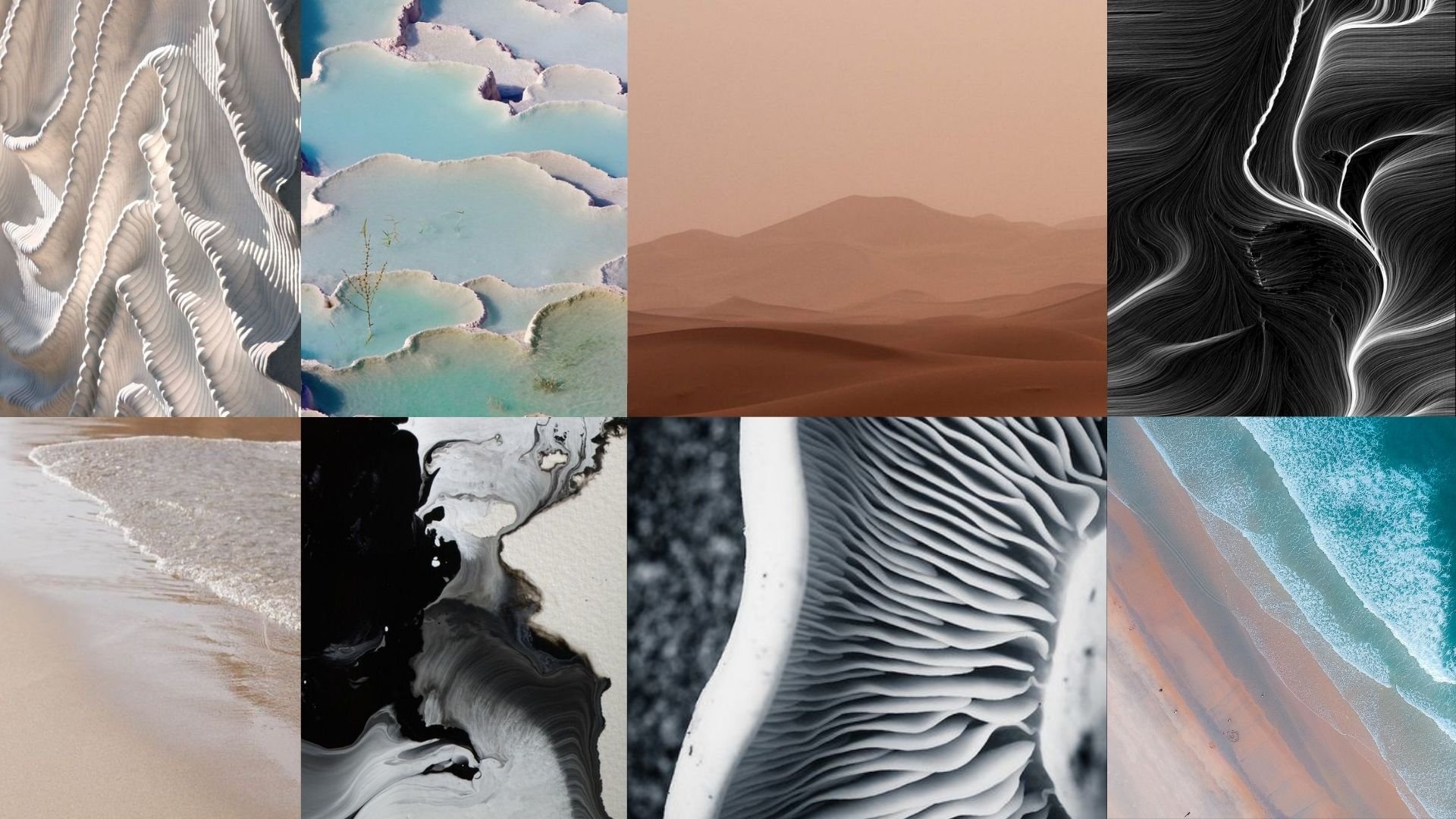
The Convergence brand needed to represent a myriad of things: the earth and her precious resources, the abstract concept of what it means to “converge,” and what can be accomplished by converging for progress.
The brand is organic - comprised of natural forms colliding, growing, changing - in motion, inspired by the things we fight to protect.
It is neutral - with mostly monochromatic colors, creating space for nuance and details.
It is elegantly functional - we use minimalistic forms, shapes, and textures create space for deeper thought and complex messages.


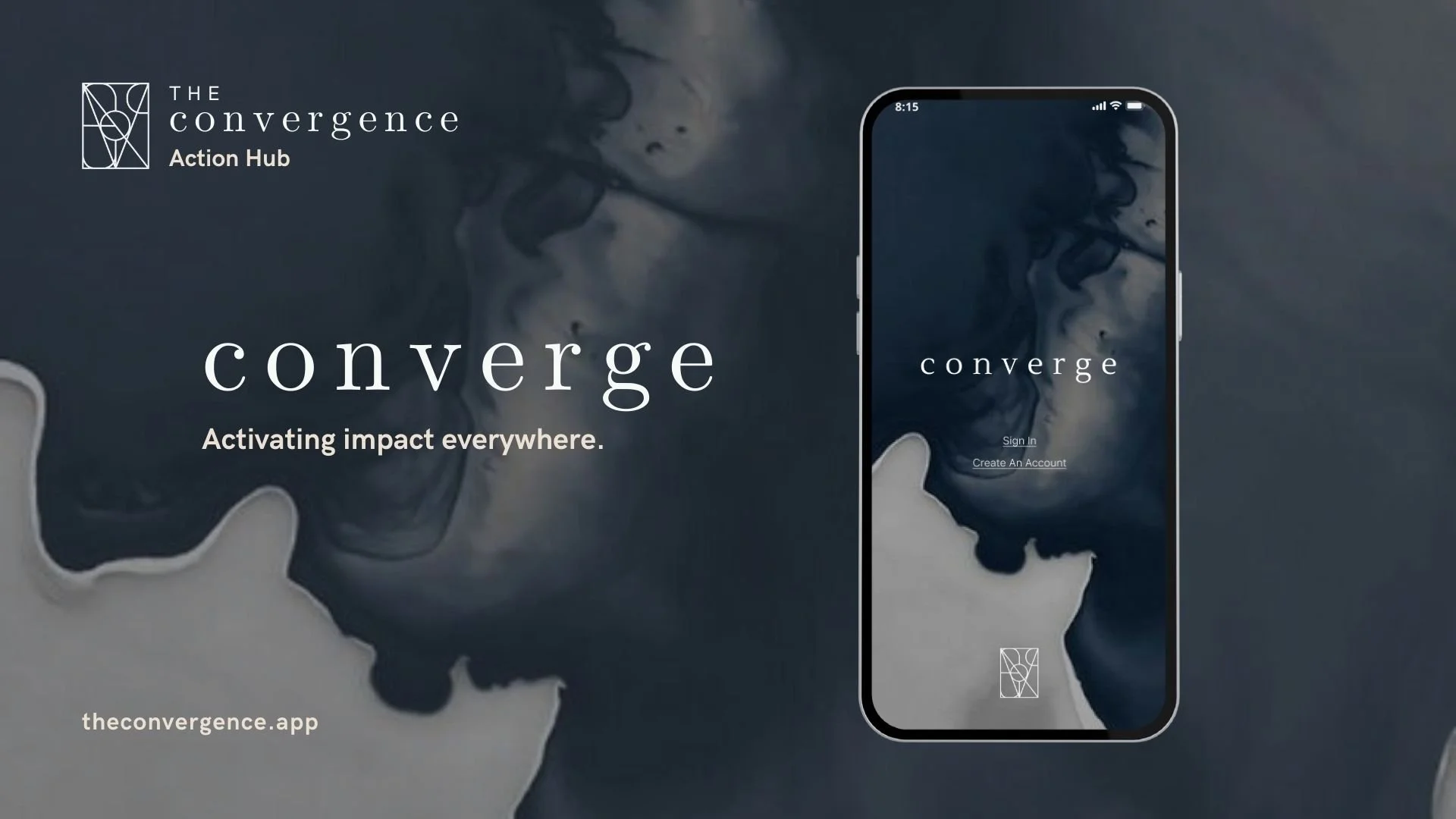
Logo
I wanted to design an abstract logo that would stand out, intrigue the audience, and be flexible enough to represent the myriad types of artistry and action happening under the Convergence umbrella. I wound up making an abstract shape, comprised of the different letters that spell out the word “convergence” and iterated with the founder until it felt right.
They were really attracted to serif fonts, for a feeling of elegance, professionalism, and refined artistry. Using a combination of serif and sans serif fonts, I created the type mark to accompany the symbol mark.


UI
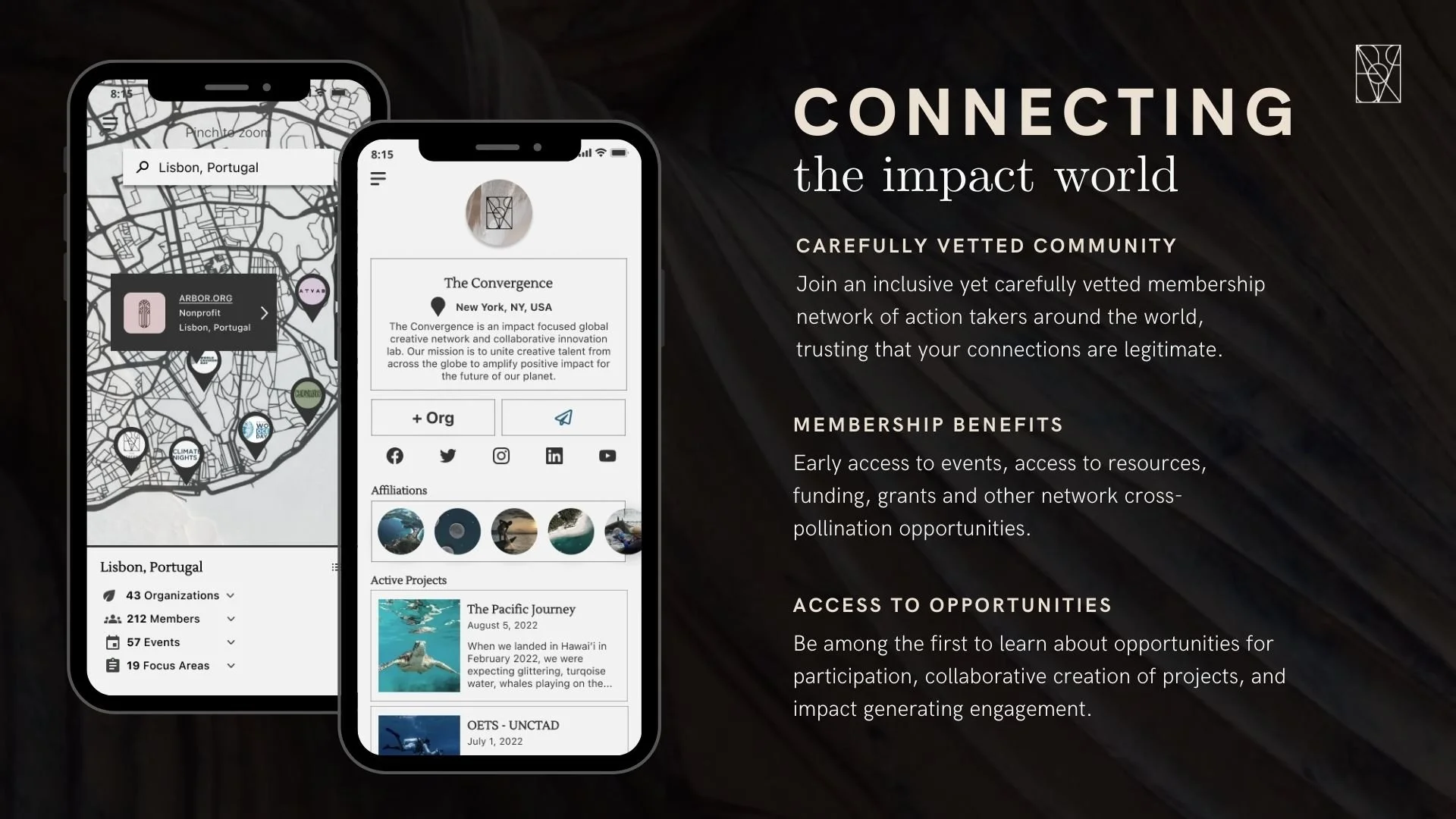
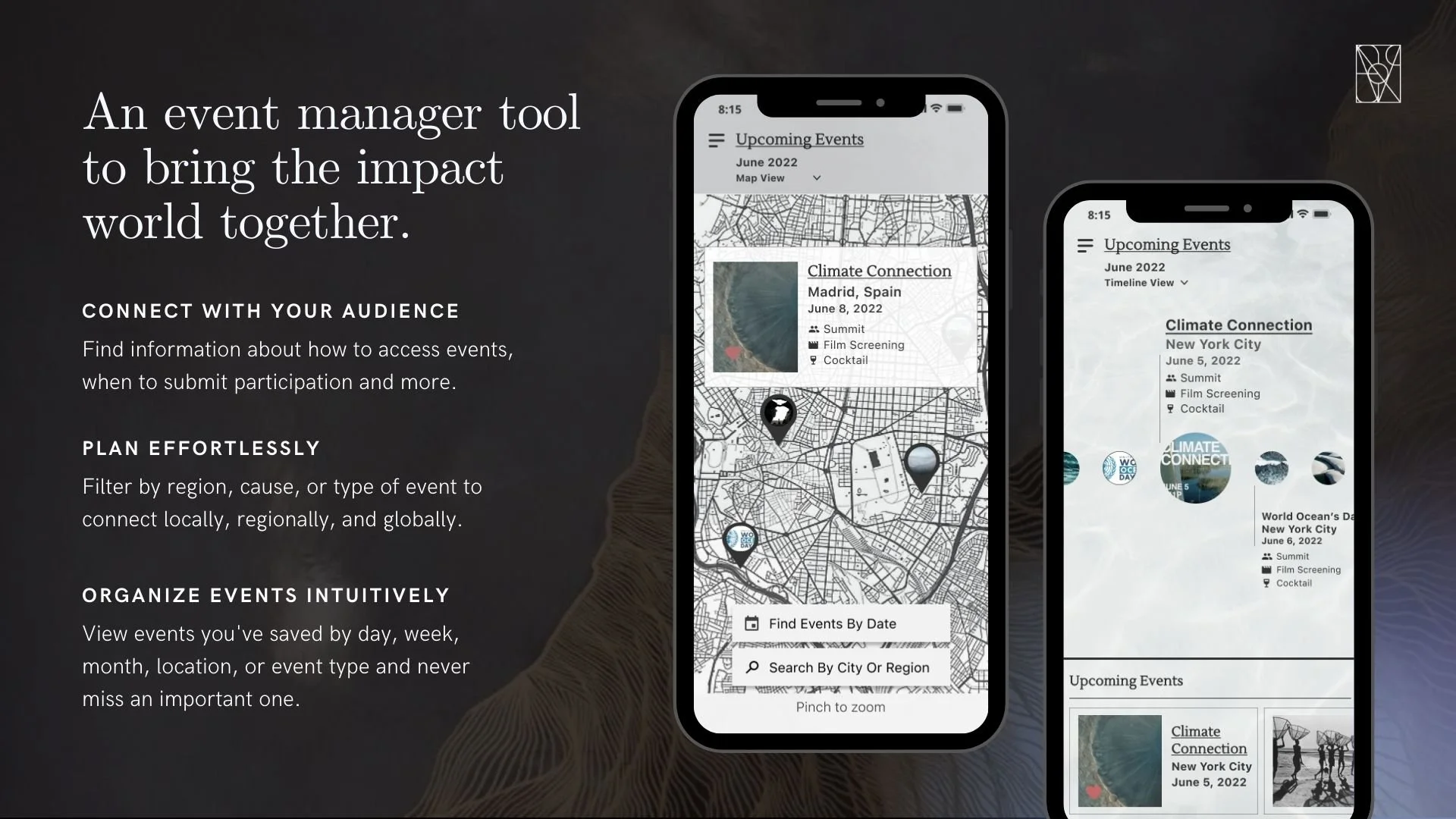
Using “how might we” questions and affinity mapping, I identified the key requirements for the first iteration of the app, and built screens for the most immediate desires:
- A scrollable global map connected to a database of regional action, events, and organizations
- A global events database to bring the entire impact world together
- Profiles for organizations and individuals to show their work and needs
- A resource hub for organizations to connect with funds to further projects
The Convergence team wanted dark imagery, and wanted to emphasize the art and films that inspired this community to gather and tell impactful stories together. I decided to use dark, nature centric imagery in a light theme UI, so interactions feel light and optimistic.