A deep tech hub focused on making the Netherlands the most fertile ground for quantum tech development through collaboration and phase agnostic support.
Quantum Delta NL's Infinity initiative marks the beginning of a groundbreaking journey aimed at transforming the European quantum startup landscape. Our mission is to position the Netherlands as the premier hub for quantum development, creating an unparalleled environment that fosters rapid scaling and growth through collaboration and connectivity. We're crafting a sustainable tech ecosystem that will pave the way for future advancements.
ROLE:
Brand Strategy & Design
UI+UX Design
Content Creation
Print and Digital Media Design
Experiential Design & Production

The process:
At the forefront of this endeavor was the creation of a unique logo mark paired with a custom typographic lockup, both designed to embody the fluid and perpetual nature of Infinity's philosophy and methodology.
We carefully selected colors that resonate with the broader Quantum Delta NL brand, infusing them with a distinctive retro flair to set Infinity apart. The design of the mark prioritizes simplicity and geometric precision, using line work that ensures versatility across both print and digital mediums.
Our aim was to evoke the concept of infinity in an unconventional way. Instead of relying on the typical infinity symbol, we introduced an innovative approach with increasing layered circles. This design choice symbolizes the notions of scaling and growth inherent in Infinity's mission. When colorized, the mark transforms into a spherical representation, radiating a sense of mystery and boundlessness.
Research & Inspiration
In conceptualizing the branding for Infinity, we sought to capture and convey an essence of futuristic optimism, hope, and curiosity, reminiscent of the golden era of space exploration in the mid-20th century.
Drawing on inspirations from classic sci-fi movies, visionary literature, and the intricate diagrams that have charted space travel, this style is deeply rooted in retro-futurism, a genre that combines elements of vintage nostalgia with futuristic imagination. The brand's identity thus resonates with a sense of technological nostalgia, echoing the tech-optimism that characterized the early space age.
However, Infinity is more than a mere homage to the past. It embodies a pioneering spirit, aiming to forge a path that's never been taken before. This duality in the brand – a reverence for the tech-optimistic past, coupled with a bold step into uncharted future territories – creates a compelling narrative. Infinity's branding is a celebration of human curiosity and the relentless pursuit of progress.


Journey Mapping & Iterations
The Infinity story is vast, goals are unlike anything that currently exists in the finance and VC worlds, and the attitude behind the brand seeks to dismantle current ways of approaching tech. We started by identifying the primary goals, problems Infinity sought to address, and how the Infinity model works. This led us to map out what types of graphic assets we would need to demonstrate some of these complex offerings, and identify case studies that exemplify the Infinity values in action.
(Journey maps are hidden to protect proprietary information)

Branding

The team at Infinity emphasized the importance of incorporating visual elements that represent their unique and cyclical approach to the investment process.
In response, we explored various design concepts, focusing on stacking shapes and orbital, space-themed interpretations of the infinity symbol. Each design iteration was an abstract representation of Infinity's diverse offerings, encapsulating their non-linear, responsive approach.
The end result is a sleek, dark-themed presentation that captures the essence of journeying through space. The design not only conveys Infinity's innovative process but also immerses the viewer in a unique visual experience.
(only select pages are available for viewing to protect proprietary information)

Logo Iterations
The Infinity logo is a play on the aforementioned principles to create an untraditional version of the infinity symbol. The double loop is implied, while maintaining a simple, clean, and round symbol mark. Paired with custom broken lettering, the overall mark feels approachable, clean and professional, and fresh, rather than stuffy and institutional. I worked with my awesome graphic designer, Julia Howard, to iterate until it felt right.


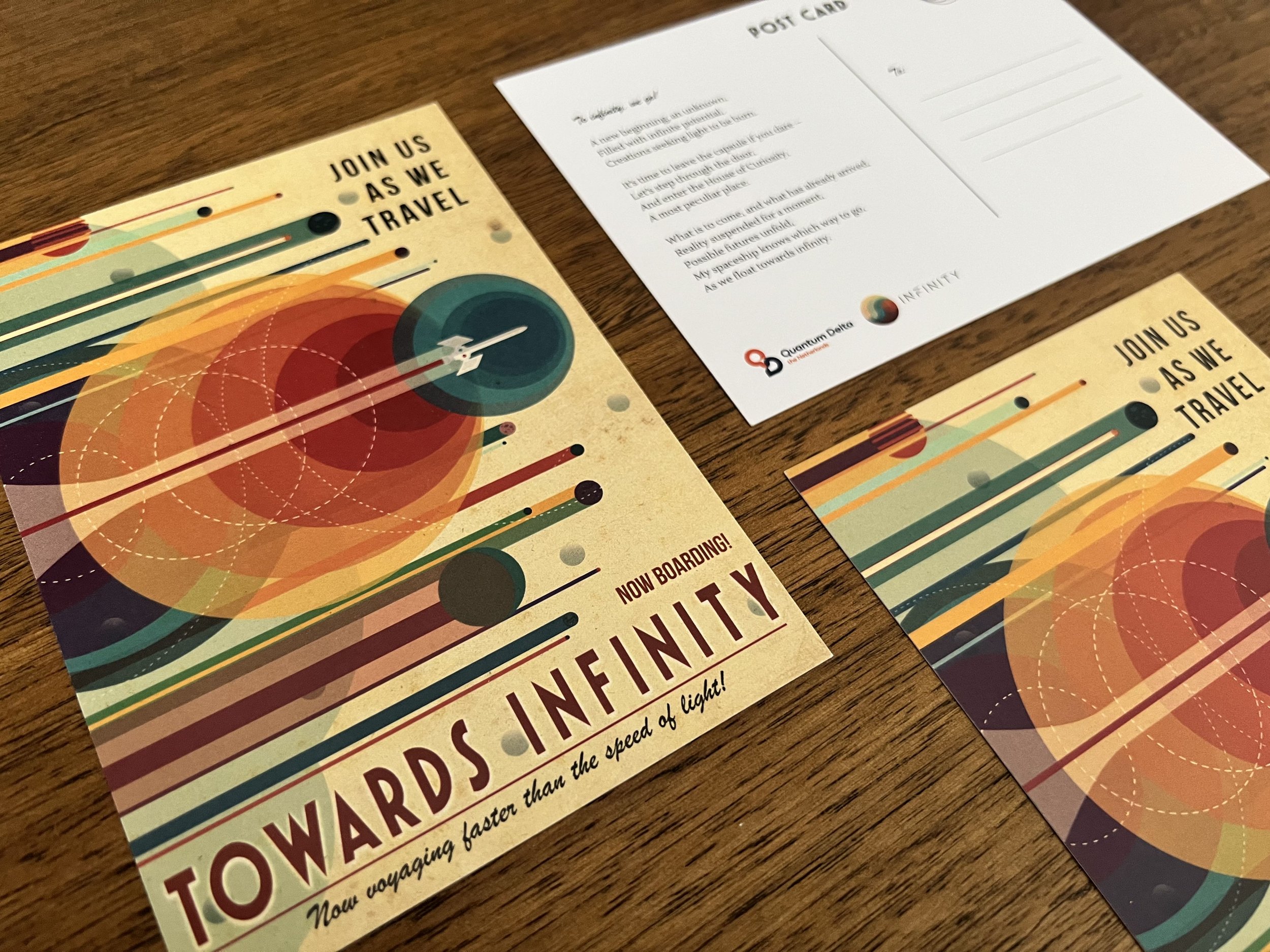
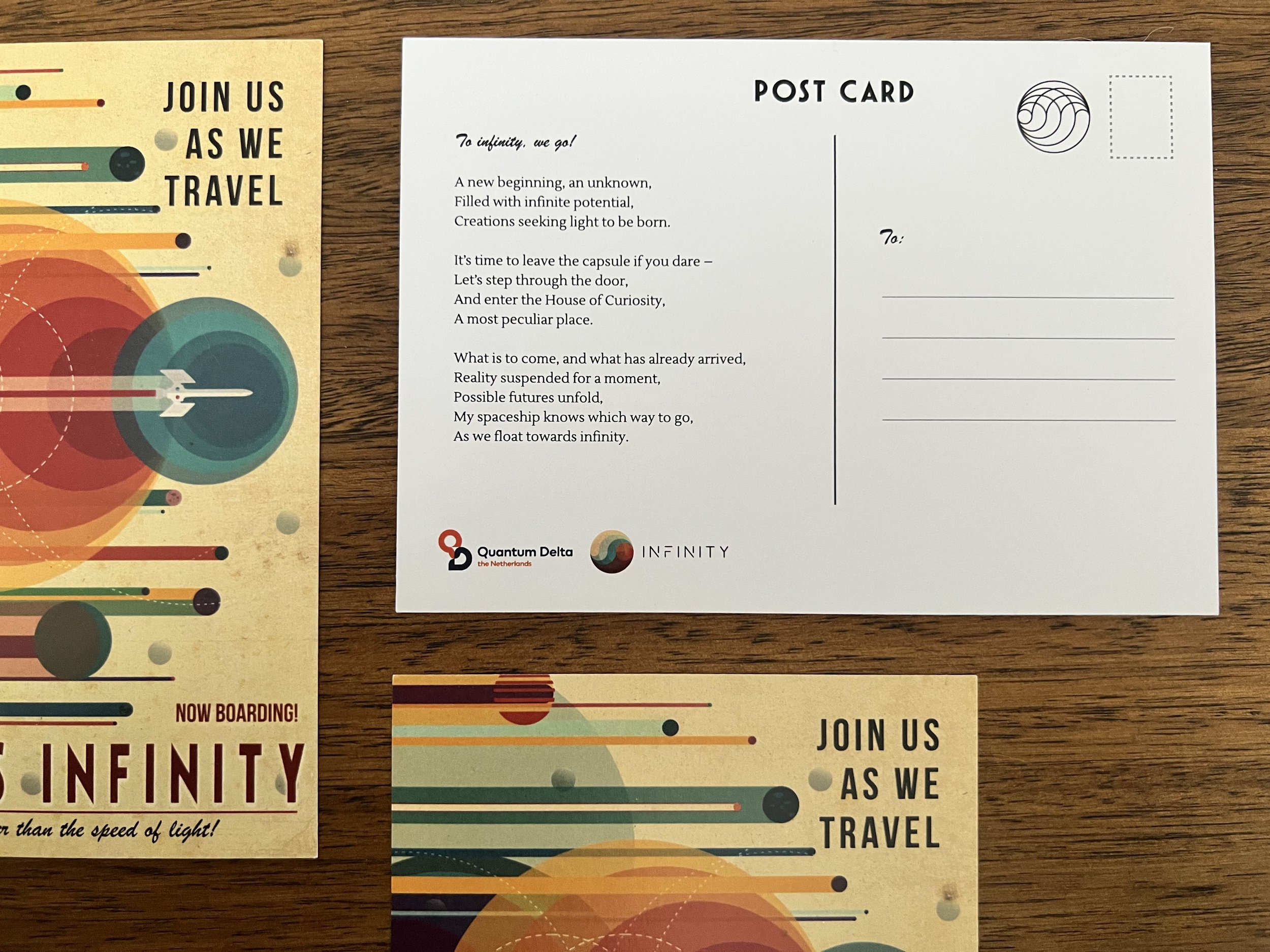
Print Materials
For Infinity’s debut event in San Francisco, we designed a postcard for guests to take home, complete with a moody sci-fi poem about the voyage they would be joining. The postcard was a way for guests to see the visual branding for the first time, and feel immersed in the maiden voyage excitement. Guests who couldn’t attend in person were mailed one.